Bambu Lab A1, Bambu Studio 2.2.2.56
Getting sharp text on a 3D print in Bambu Studio
Text is the hardest thing to print, and a thin script font on a 0.4mm nozzle is the hardest version of that. This is the same word sliced twice, side by side, changing one thing at a time until it reads. The important structural point arrives early: almost all of these settings go on the text object rather than on the whole model, so sharp text does not have to mean a slow print. There is one exception and it is called out.
What I used
Matte for the plate the text sits on. Color choice turns out to matter more than expected: the first print here used two colors too close together and the result was genuinely hard to judge, which wasted a print. Pick a pair with obvious contrast before you test anything.
Steps
Build a control and an improved copy
Put a flat rectangular block on the plate, add your text with the text tool, then clone the whole thing. Name one Control and one Improved and only ever touch the second. Everything below is judged against that control, and without it you are comparing a print to your memory of a print. The test here uses French Script MT at 10mm with a thickness of 0.70mm, deliberately chosen as about the hardest thing on the font list: thin strokes, fine joins, and a lot of detail that has no business printing on a 0.4mm nozzle.
Slice it as it comes, and see how bad it is
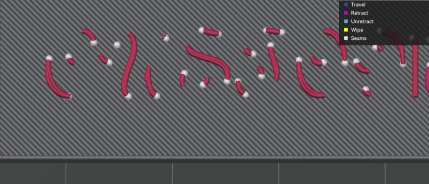
Straight out of the box the text is not text. It slices into disconnected fragments of stroke with gaps everywhere, and you cannot read the word. This matters as a starting point because it sets the scale of what the settings below are actually doing: this is not a tuning exercise, it is the difference between a legible print and a broken one.
Select the text object and drop every line width to 0.25
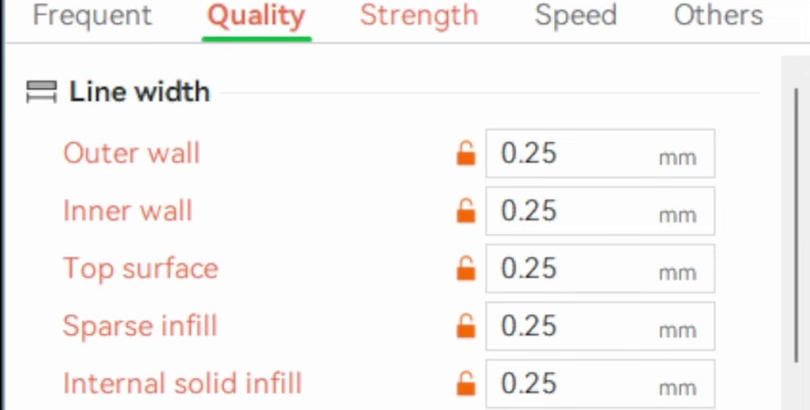
This is the single biggest change on the page, and the detail that makes it cheap is what you select first: click the text object in the object list, not the block, not the plate. Then in Quality, set all five line widths to 0.25mm. The defaults are 0.42 for outer wall, top surface and internal solid infill, and 0.45 for inner wall and sparse infill. Slice again and the letters appear.
One thing to know before you copy this. The most upvoted response to the video this page comes from, twice over, was that this is the wrong lever: set the wall generator to Arachne instead and let the slicer vary the line width where the strokes get thin, rather than forcing one narrow width everywhere. Several people said it, one of them reported trying both and found Arachne helped more than everything here combined. I have not run that comparison, so I cannot tell you which wins. If you only try one thing, their answer may well be the better bet, and it is the first thing in what I would do differently.
Compare against the control before going further
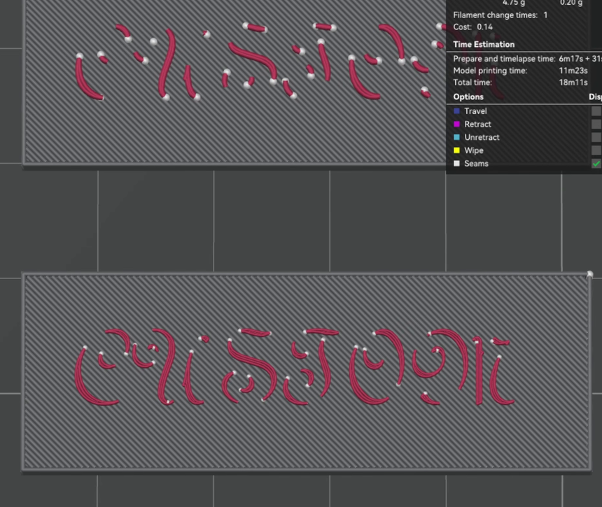
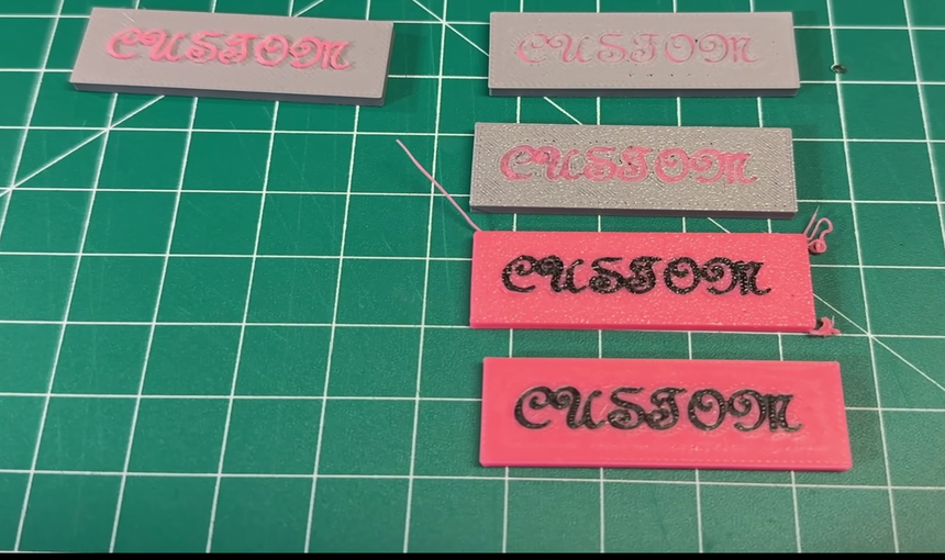
Line width alone gets you from unreadable to readable. The top plate here is the control and the bottom is the improved copy with nothing changed but those five values. The letters are still not clean, there are still gaps in the thin joins, but the word is a word. Stop and look at this comparison before you change anything else, because it is the point at which most of the available improvement has already happened.
Wall loops to 4, and turn on detect thin wall
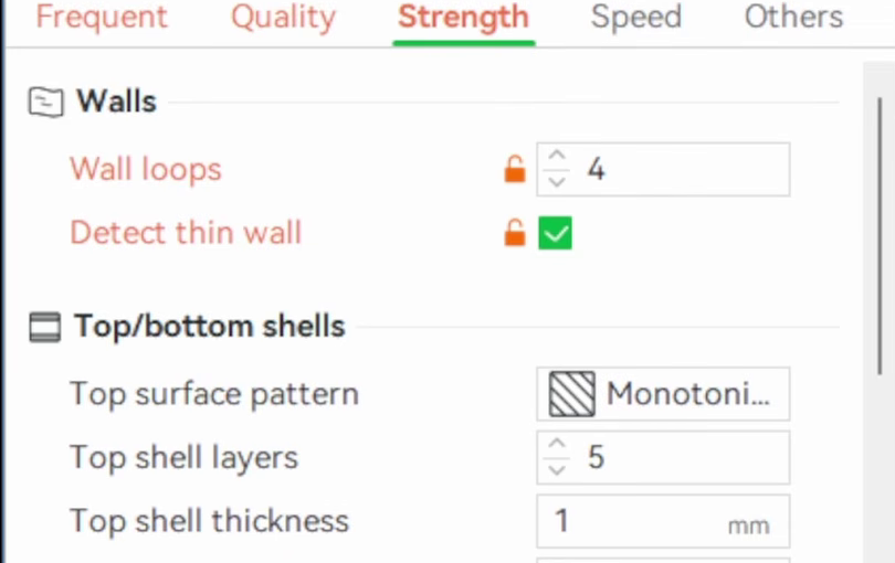
Still on the text object, in Strength: wall loops from 2 to 4, and tick detect thin wall. Together with the line widths, these three settings are the ones worth having if you change nothing else. Detect thin wall is the one doing the specific work here, because the thin joins in a script face are exactly the features a slicer drops when a region is narrower than it knows how to fill.
Shells and infill, with an honest caveat
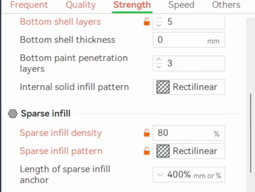
Top surface pattern from monotonic line to rectilinear, top shell layers from 5 to 6, bottom shell layers from 3 to 5, sparse infill density from 15% to 80%, and sparse infill pattern from grid to rectilinear. Here is the caveat, and it is the most useful sentence on this page: these were all changed in the same pass as everything else and never isolated, so I cannot tell you whether any of them helped. The reasoning on rectilinear was that it looked like a tighter pattern than grid, which is a guess rather than a finding. They are listed because they were done, not because they are recommended. If you are deciding what to bother with, the previous two steps are the ones with evidence behind them.
Slow the text down, not the print
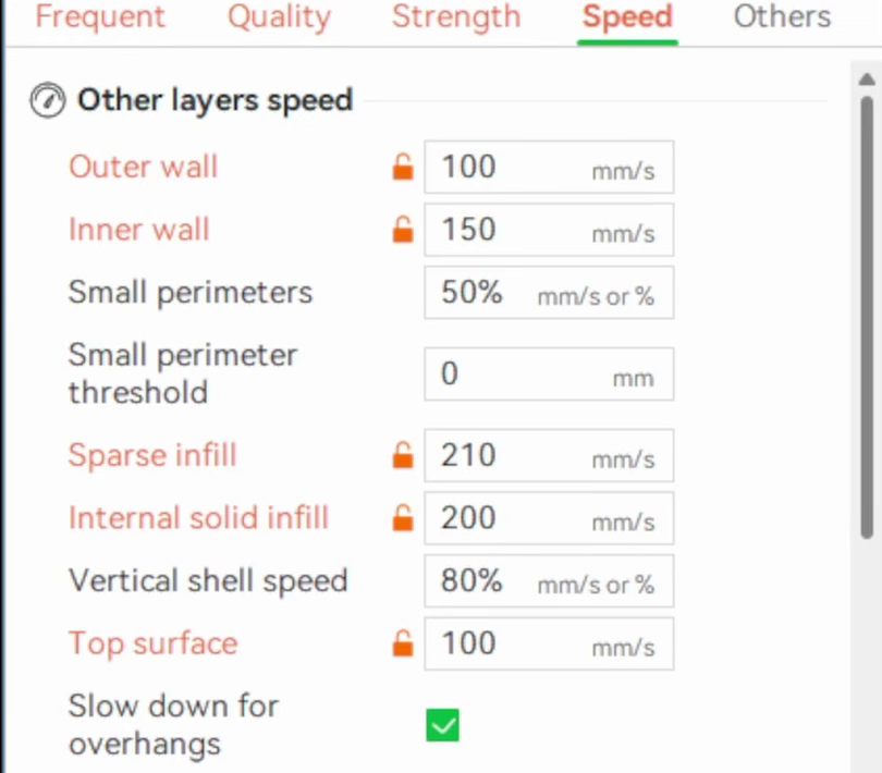
On the Speed tab for the text object: outer wall 200 to 100mm/s, inner wall 300 to 150, top surface 200 to 100, sparse infill 270 to 210, internal solid infill 250 to 200. The walls and top surface are halved, the infill speeds much less so, which is worth knowing if you have heard this described as halving everything. Because this is on the text object, the printer only slows down while it is laying the letters. The rest of the plate runs at full speed.
Layer height, and the one change that costs you
Layer height to 0.12mm. This is the exception to everything above: it is set at the global level, so it applies to the entire plate and it does slow the whole print down. It is also the only setting here that a per-object override does not straightforwardly cover, because layer height is a property of the layer rather than of a region. Worth being deliberate about. If the text is a small part of a large model, ask whether the finer layers everywhere are worth it before you accept them.
For engraved text, switch the text from Part to Modifier
Engraved text is where this gets genuinely clever. Rather than treating the recessed text as its own body, take the text in the text tool and change its operation from Part to Modifier. The block then prints with the text object's improved settings in exactly the region the letters occupy, and nowhere else. It is the same mechanism as any other modifier, applied to a letter shape instead of a cube, and it means the engraved version needs no separate tuning: clone the improved copy, flip the operation, done.
Thin text gets swallowed, so make it bolder
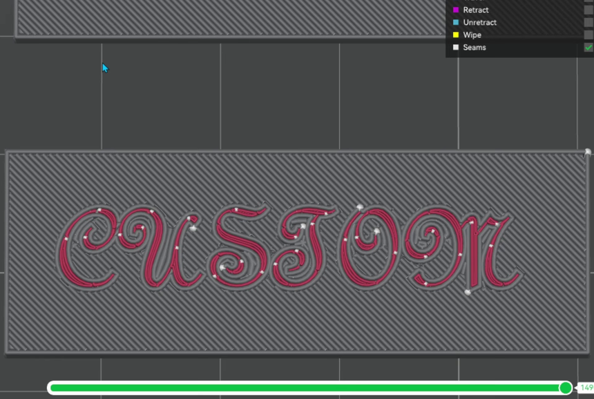
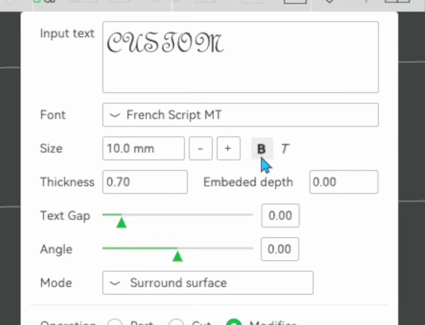
Look at the layer view and count the layers of text color at the top: five or six, and thin. By the time the print reaches the top surface, the surrounding material starts overlaying the letters and eats the fine detail. The fix is not a setting, it is the glyph. Turn on bold in the text tool and the strokes thicken enough to survive. The same dialog also holds the mode and operation controls, so it is worth knowing your way around: mode here is surround surface, which is what makes the text follow the face it is sitting on rather than floating in space.
Printing face down was worse, not better
The obvious idea for engraved text is to print it face down against the plate and let the plate give you a flat, smooth surface. It came out blurrier than the same text printed face up, which was not the expected result. The likely cause is the textured PEI plate: the graininess of that surface transfers into the letters. Two things to be clear about. This was not retested on a smooth plate, so treat the finding as scoped to textured PEI and no further. And several readers pointed out afterwards that face down works fine if you also tick only one wall on first layer, and set the first layer filament sequence so the text color prints before the surround. Neither was done here, so the fair statement is that face down lost in this test, not that face down is wrong.
Where it goes wrong
Setting a 0.25mm line width on a 0.4mm nozzle looks like it cannot possibly work
Why: It is the most common objection to this whole approach and it is a reasonable one, asked four separate times on the video. The nozzle is a physical 0.4mm hole, so a 0.25mm line looks like a number the slicer is only pretending to honour.
Fix: Extrusion width is set by how much plastic goes down per unit of travel, not by the bore, so a 0.4mm nozzle does lay lines narrower than 0.4mm, down to a point. Where that point is is the real question and it is machine dependent: one experienced commenter reports never getting consistent results below 0.28mm on a 0.4 nozzle, and switching to a 0.2mm nozzle for fine text instead. 0.25 worked here. If your thin strokes are still breaking up, that floor is the thing to suspect.
The text loses its detail in the last few layers
Why: A thin glyph only occupies five or six layers of color at the top of the print, and the surrounding surface starts overlaying it as it closes out. The letters are being swallowed rather than printed badly.
Fix: Thicken the glyph rather than chasing settings. Bold in the text tool is the one-click version. Raising the text thickness does the same job with more control.
Text printed face down against the plate comes out blurry
Why: On a textured PEI plate the graininess of the plate surface transfers into the letters, which is worse than what the top surface gives you.
Fix: Print it face up, or if you need face down, do the two things this test did not: tick only one wall on first layer in Quality, and set Plate settings, First layer filament sequence, Customize so the text color lays down before the surround. Both came from readers who print text face down successfully. Untested here, and untested on a smooth plate.
The text floats in space instead of landing on your model
Why: Common with an imported STL rather than a primitive. The text is placed in the scene rather than projected onto a face, so it hangs beside the object and no amount of dragging lines it up properly.
Fix: Tick the surface option in the text dialog, which makes the text follow the face you clicked, and use embed depth to set how far into the surface it sits. This was the single most common confusion in the comments and the answer came from another reader.
You cannot tell whether your test print is better or not
Why: Two filament colors too close in tone. The first print here was hard to judge at all, and the top surface artifacts hid some of the detail on the good sample, which is the print you most need to see clearly.
Fix: Reprint with obviously contrasting colors before you conclude anything. It costs one plate and it is cheaper than drawing the wrong conclusion and tuning against it.
Sharp text made the whole print slow
Why: The settings were applied globally rather than to the text object. Halved speeds and 0.12mm layers across a large model are expensive, and most of that cost buys nothing because most of the model is not text.
Fix: Select the text object in the object list first, then change settings. Everything except layer height works per object. If you have already done it globally, reset the global values and reapply on the text.
What I would do differently
- Test Arachne against this properly. It was the most upvoted response to the video by a wide margin, twice, and one reader who tried both said it helped more than everything in the video combined. The argument is good: let the slicer vary line width where strokes get thin instead of forcing one narrow value everywhere. It also has its own sub-settings, minimum wall width as a percentage of nozzle diameter and a minimum feature size, so a fair test means tuning it rather than just switching it on.
- Isolate the shells and infill changes instead of moving nine things at once. Five of the settings on this page have no evidence behind them and could be dropped tomorrow without anyone noticing, and I do not know which five.
- Try ironing the top surface for raised text, which a reader suggested and which the resin dome page already relies on for a flat finish. It is a plausible fix for exactly the top surface artifacts that made the good sample hard to photograph.
- Retest face down on a smooth plate, with one wall on the first layer and a customized first layer filament sequence. Three separate readers print text face down and get sharp results, which suggests the problem here was the setup rather than the idea.
- Find the small text limit. Several people asked how far this scales down, and one reported that below about 3mm cutting the text in beats raising it. Everything on this page was tested at 10mm.
Read next
- Using modifiers in Bambu Studio to change part of a print
The mechanism behind the engraved text trick above. Worth reading if switching the text operation to Modifier felt like magic, and for the height range variant a reader suggested for first-layer-only settings.
- Is a 0.2mm nozzle worth it for small prints?
The other answer to thin strokes on a 0.4mm nozzle, and the one experienced readers keep reaching for. If a 0.25mm line width still leaves gaps, the nozzle is the next variable.