AlgoLaser MK3 15W, LightBurn
What actually engraves well on a beginner diode laser
The thing nobody tells you starting out is that there is no single speed and power setting to find. The material decides more than the settings do, and the artwork decides more than either. This is five materials run on a 15W diode laser by someone still learning, including the two that failed badly, because the failures turned out to teach more than the successes.
Disclosure before anything else: AlgoLaser supplied this machine for review. Nothing here was shown to them before publication, the failures are in rather than edited out, and the findings below are about materials rather than about the machine.
What I used
Supplied by AlgoLaser for review. 400 x 400mm bed, 15,000 mm/min, works with LightBurn, and has a touchscreen with built-in projects that is genuinely useful for quick text jobs. An 8W version exists if you only need light work. Coupon dan12 takes 12% off.
Where all the serious work happened. The machine's own touchscreen handles simple text fine, but layer control for cut order is the thing you will want almost immediately.
Similar to what I used rather than the exact ones. These gave the cleanest results of the whole test.
Similar to what I used. Two millimetres is what the cut settings below are for.
Similar to what I used. Engrave well and smell while doing it.
Similar to what I used. Worth reading the coaster step before buying: the two-tone ones I already had were the single worst result in this test, and a plain lighter coaster worked far better.
Cheap enough to fail on repeatedly, which is what they are for here. Measure them rather than trusting the label.
Universal, so it overhangs a smaller machine and leaves an open gap underneath. Ships with a 2.75 inch duct port and a weak fan, both of which I replaced.
The part that makes indoor engraving reasonable. Six inch for maximum flow, stepped down to the enclosure's smaller port.
The rest of the venting run, out through a basement window. The adapter plus some cling film is an honestly bodged airtight joint, and cutting a proper hole in the enclosure is the real fix.
Where the keychain shapes came from.
Steps
Sort out ventilation before anything else
This is not the fun part and it is not optional. Engraving leather smells strongly, acrylic and wood produce smoke, and none of it should be filling the room you are sitting in. The setup here is an enclosure vented out of a basement window with a 6 inch inline duct fan, which pulls hard enough to cope even where the joints are imperfect. Two honest flaws in it: the enclosure is universal so it overhangs the machine and leaves a gap underneath, and its 2.75 inch port needed an adapter and some cling film to meet a 6 inch hose. The airflow copes with both, but the right fix is cutting a proper hole.
I used: Creality laser enclosure, AC Infinity 6 inch inline duct fan
Run a test grid, and expect it to surprise you
Before any real project, run a speed and power grid on a scrap of the actual material. Not a similar material, the one you are going to use. On balsa this produced two results that make no sense until you think about them.
A pass at 6000 mm/min and 20% power came out nice and dark while the laser was slightly out of focus. Focusing the laser and running exactly the same settings came out lighter. Then raising the power made it lighter still. The best explanation is that on a very soft wood, more energy starts vaporizing the darkened surface rather than toasting it, so past some point you are removing the mark you are trying to make. More power does not always mean darker.
Coated aluminum cards, the easiest clean result
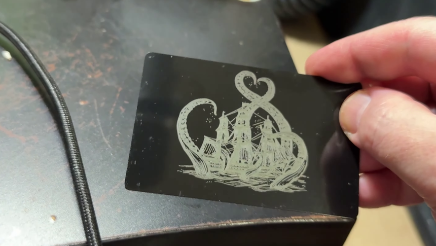
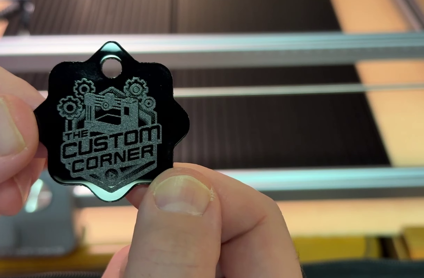
If you want something that looks professional on the first or second attempt, this is it. The laser removes a black coating and reveals the metal underneath, so you get hard edges and high contrast without much tuning. Be clear about what it is not: this is marking a coating, not deep engraving into metal, which needs a fiber laser. For black anodized-style cards, the result is genuinely sharp and it held fine detail better than any of the wood.
I used: Black coated aluminum cards
Black acrylic, where the artwork decides everything
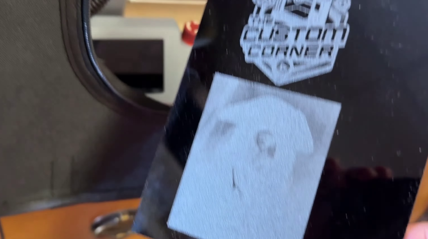
This is the most useful single finding in the test, and both halves of it are on one piece. The logo at the top is bold graphic artwork with solid shapes and clean edges, and it came out excellent. The image below it is detailed and tonal, and it turned into a frosted gray block. You can just about find the detail by holding it to the light at the right angle, but straight on it does not read at all.
So black acrylic is not a material that either works or does not. It works for bold, high-contrast, graphic artwork, and it fails for anything that depends on fine tonal gradation. Decide which one your design is before you burn it.
I used: Black acrylic sheets, 2mm
Burn your placement onto scrap instead of framing repeatedly
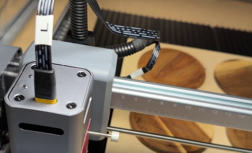
The most reusable trick here. Draw a rectangle or circle the size of your blank in LightBurn, then burn it faintly onto a piece of scrap at low power for about five seconds. You now have an exact outline showing where the material has to sit, so you can drop each blank into place instead of framing and nudging every time. It pays for itself immediately on a batch, and it is the difference between engraving four coasters and engraving four coasters twice.
The dark coaster failed and the light one worked
The project I most wanted was a set of city map coasters. I had blanks with a mix of dark and light areas, used settings already proven on plain wood, and ran all four at once. The dark regions engraved acceptably and the lighter regions came out extremely faint, even after a second pass, and the result was too inconsistent to keep.
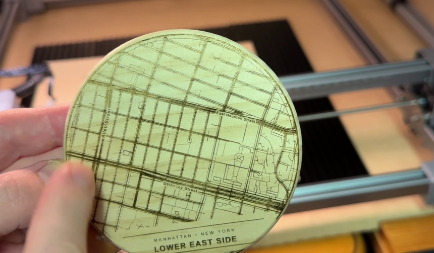
Switching to a plain lighter coaster, the same file, the same settings, gave a clean readable map. The laser was never the problem. Contrast comes from the difference between the burn and the surface around it, so a surface that is already dark and already varied has very little contrast left to give you.
I used: Wood coasters
The same design on a lighter coaster
Same file, same settings, different blank. The street detail is legible across the whole coaster and the contrast holds up. Worth noting that this was also the coaster used for the original test grid, which is the actual lesson: the material that passed the test is the material the settings are valid for.
Cutting balsa, and why it took several attempts
Cutting needs layers, and getting the order right matters: engrave first, then cut any inner holes, then cut the outside border last, because once the outside is cut the piece is free to move. Put each of those on its own LightBurn layer.
It took several tries. The first failed because the laser was out of focus. The second was focused but did not cut through. Slowing down and raising power gave a lighter engraving than before. The material was also not what I thought: labelled as 2 to 3mm, it measured nearer 1mm, which invalidated the settings I had been reasoning from. Measure the stock.
I used: Balsa sheets, Vecteezy
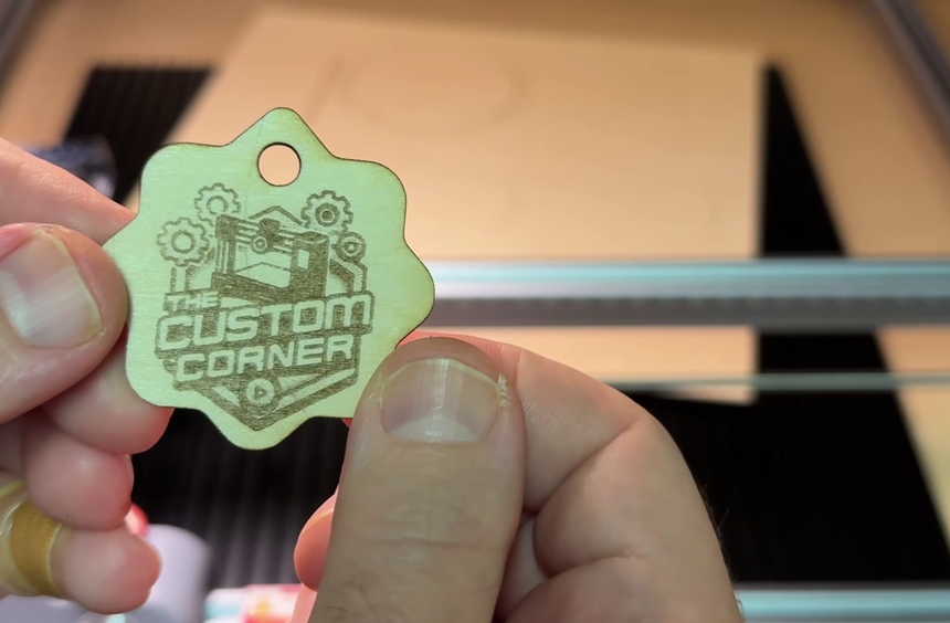
Black acrylic cut cleanly on the first attempt
After the balsa struggle, 2mm black acrylic cut correctly first time and gave the best-looking piece in the whole test. Clean edges, no scorching along the cut, and it feels like a finished product rather than a test piece. Between this and the logo engraving, acrylic is the material worth buying more of, as long as the artwork suits it.
I used: Black acrylic sheets, 2mm
The cut settings that worked
For 1mm balsa: the keychain hole at 500 mm/min, 100% power, two passes, and the outside edge at 700 mm/min, 100% power, two passes. For 2mm black acrylic: the inner hole at 250 mm/min, 100% power, two passes, and the outside edge at 300 mm/min, 100% power, two passes.
Note that in both cases the small inner hole needs to go slower than the long outside edge, which is worth knowing rather than discovering. Tight curves and small holes give the laser less continuous travel and behave differently from a long straight cut. Treat all of these as a starting point on your own machine and your own stock, not as values to copy blindly, which is exactly what the test grid at the start is for.
Leather, and the touchscreen
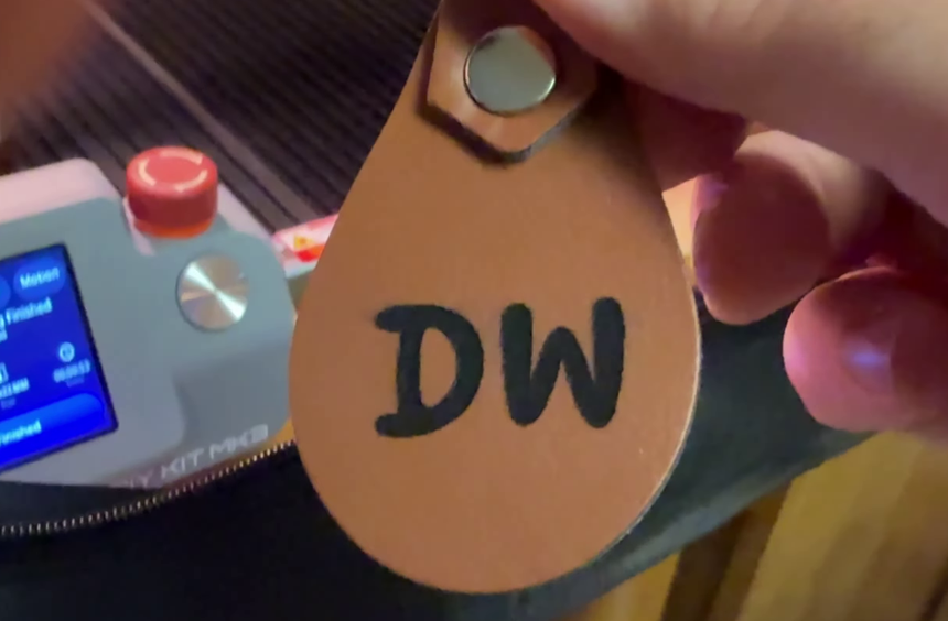
Leather engraved well and was the one case where the machine's built-in text tool made more sense than LightBurn. You pick font, size, material, quality, speed, passes and power on screen and go. The mistake worth avoiding: a font size that looks right on the small screen and in the framing preview can be far too small on the actual blank. Mine was, so the first side was wasted and the second side, with a much larger size, came out well. Leather also smells noticeably while burning, so this is the material that most rewards having sorted the ventilation out first.
I used: Leather keychain blanks
Where it goes wrong
Raising the power makes the engraving lighter instead of darker
Why: On very soft woods like balsa, past a certain point the beam starts removing the darkened surface rather than darkening it further. You are burning away the mark you just made.
Fix: Come down in power rather than up, and test in both directions from wherever you are. This is also why a test grid beats guessing: the relationship is not monotonic, so reasoning from one data point sends you the wrong way.
A detailed image on black acrylic comes out as a gray smudge
Why: Acrylic engraving gives you one tone, frosted white against black. Artwork that relies on gradation has nothing to map that range onto, so everything collapses into a single flat block.
Fix: Use bold graphic artwork with solid shapes on acrylic and save photographic or tonal images for a material that holds gradation. This is an artwork decision, not a settings problem, and no amount of tuning fixes it.
Settings proven on one piece of wood fail on another
Why: Contrast is the difference between the burn and the surface it sits on. A dark blank has less contrast available to begin with, and a two-tone blank has different amounts in different places, so one setting cannot serve the whole surface.
Fix: Test on the exact blank you are going to use. If a blank is dark or varied, expect a weak result no matter what you do, and reach for a lighter, plainer one when the design carries fine detail.
A cut does not go all the way through, or goes through inconsistently
Why: Two separate causes that look identical. The laser can be out of focus, or the material can be a different thickness from what you assumed. Balsa here was sold as 2 to 3mm and measured about 1mm.
Fix: Check focus first, since it is quick, then put calipers on the stock. Both were wrong at different points here and each one cost a piece.
Text engraved from the touchscreen comes out far too small
Why: A size that looks correct on a small screen, and in the framing preview, is not a reliable guide to how it lands on the blank.
Fix: Go larger than looks right, and test on scrap or the back of the blank first. Leather keychains have two usable sides, which is what saved this one.
Pieces shift or land in the wrong place between jobs
Why: Framing and nudging by eye every time, which is slow and drifts across a batch.
Fix: Burn a faint outline of the blank onto scrap at low power once, then use it as a jig. Five seconds of engraving replaces the framing step for every piece after it.
What I would do differently
- Buy blanks for the design rather than designing for the blanks I already own. The map coaster failed because I tried to use two-tone coasters I liked the look of, and the fix was a plainer blank rather than better settings.
- Test focus deliberately rather than assuming focused is correct. A slightly defocused pass gave the darkest result on balsa, which suggests focus is a variable to tune rather than a box to tick.
- Measure every sheet before designing around it. One assumption about thickness cost several failed cuts and a lot of confusion about settings that were never the problem.
- Try more coated materials. The aluminum cards were the least work for the best result by a wide margin, and coated stock in general looks like the fastest route to something that looks finished.
Read next
- Getting a glossy resin dome on a 3D printed keychain
The other way to make a keychain here. The laser cuts and engraves the blank; that page adds the glossy resin dome, and the lip trick works the same on a cut acrylic blank as on a printed one.